.png)


roomigo
In 2017 this early stage start-up needed help with UI & UX Design for their product and also a Brand Identity, including a new name for their home sharing platform.
First I interviewed the founder with a Branding workshop to get a deeper understanding of the company’s identity.
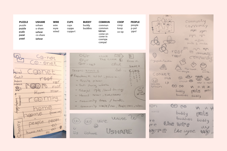
After gathering all the info from the interviews, like what they’re doing, how, why, who is involved and their values, I collected the repeated and relevant keywords I found.
These keywords are the essence of what the team is really trying to communicate and this is what helps develop the core brand identity.
Every keyword from their identity can be translated into visual language with the right set of colours, typography and style.
Here is where the visual research comes into place and I provide different mood boards for the client.
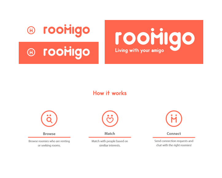
After a few rounds of drafts, options and iterations we found the right vibe they were looking for, including their logo, font, icons and visual elements.
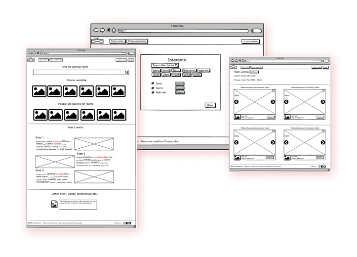
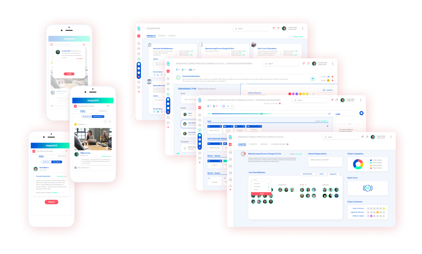
In the web & mobile design phase, first I did user and market research looking for similar platforms or solutions delivering a set of insights. I then sketched the wireframes and a clear sitemap that would allow users to find relevant content with a nice visual flow.
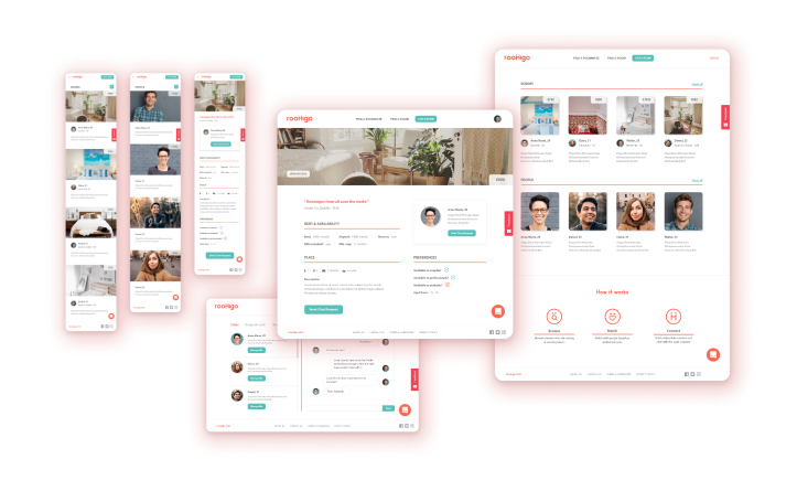
After feedback rounds, testing and iterations, I finally applied the visual language, logo, imagery and colours to the interface.
Check out the final designs below...
Recommendations


Her high level of creative thinking, eye for detail and quality of production was in constant demand by our team. I would not hesitate to recommend her.
John
Moriarty
Virginia's work has had a transformative effect across a variety of strategic projects and digital products. The quality of her work is second to none and her interpersonal and stakeholder management skills are absolutely superb.
Danny
Browne
Virginia is a fantastic and talented Designer, her visual style is amazing and she was a really well liked and appreciated member of the team.
Graham
Nolan
She's very flexible to work with existing brand guidelines, adding more through her criteria and defending well her design decisions. She transformed heavy content and messy interfaces, into clear and easy to consume valuable assets.
Sara Jane
Gonzalez
I had a vision of what I wanted but it can be very difficult to find a graphic designer capable of bringing that vision to life as I had imagined it. Virginia did exactly that. I was extremely impressed with Virginia's work which far exceeded expectations.
Ed
Burke
Clear communication on process and quick turnaround makes a difference to us, that's what we got with Virginia. She's is a delight to work with, an awesome hire if you're looking for a design unicorn.
Neill
Gernon
While the designs themselves were fantastic, what we really appreciated was the iterative, communicative and process-driven nature of the working relationship.
Toby
Farren
She is a brilliant designer, and her creativity, ability to meet tight deadlines and desire to meet customer expectations make her the ideal designer for any organisation.
Tianyi
Wang
Next Project
waypoint